Best Valentine’s Day Vignette Styling: Instagram Magic 2026
I absolutely love the art of vignette styling, especially when Valentine’s Day rolls around. There’s something incredibly satisfying about creating those perfectly curated little moments in your home that make you want to grab your phone and capture the beauty.
Today, I’m sharing everything I’ve learned about creating Instagram-worthy Valentine’s Day vignettes that feel authentic, elevated, and decidedly romantic without being overly themed.
If you are looking to add some awesome seasonal shirts into your wardrobe this year, click on the images below. Use code WINTER15 for a 15% discount on top of our current fall price while supplies last. That is a total of 40% OFF!!!! We ship to the USA and Canada.

SHOP THE LOOK!
Understanding the Vignette Styling Foundation
Let me start by saying that a great vignette isn’t about cramming every Valentine’s item you own into one space. It’s about intentional curation.
I think of vignettes as visual stories. Each piece should have a purpose and contribute to the overall narrative you’re creating. When I style for Valentine’s Day, I’m always thinking about romance, softness, and intimacy rather than literal heart shapes everywhere.
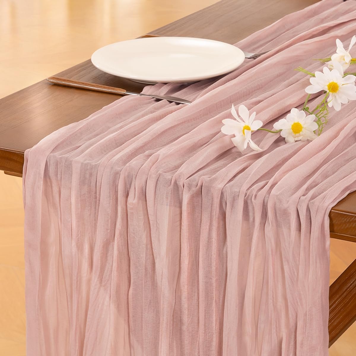
The foundation of any stunning vignette starts with your base surface. I typically use vintage wooden trays, marble cake stands, linen table runners, or even stacked books to create different levels and visual interest. These foundational pieces anchor your styling and give you a framework to build upon.

Mastering the Rule of Three
Here’s a vignette styling secret that transformed my vignette game completely. The rule of three creates visual harmony that your eye naturally finds pleasing.
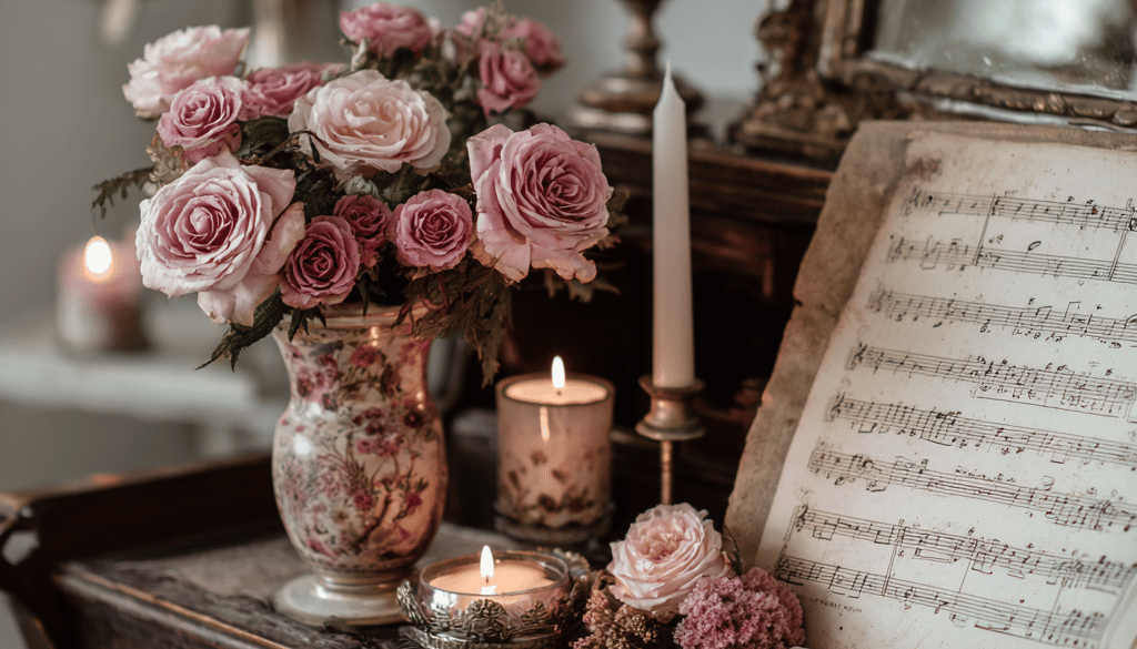
I group items in odd numbers, particularly threes or fives. For Valentine’s vignettes, this might mean three pillar candles of varying heights, a stack of vintage books with a small bud vase, and a decorative object like a vintage frame or ceramic heart.
The varying heights create dimension. Your eye travels through the vignette rather than landing flat on everything at once. I always include one tall element, one medium element, and one low element to achieve this beautiful visual flow.
When you photograph these arrangements, the depth you’ve created translates incredibly well to Instagram. The shadows and layers add that professional quality that makes people stop scrolling.

Color Palette Beyond Red and Pink
I’m going to be honest with you. While I adore traditional Valentine’s colors, my most successful Instagram vignette styling sets have featured unexpected color stories.
Consider dusty mauve paired with warm terracotta and cream. The combination feels romantic and earthy without screaming Valentine’s Day. I’ve also fallen in love with sage green combined with the softest blush tones and natural wood elements.
For something more dramatic, try burgundy with charcoal gray and brushed gold accents. This palette feels moody and sophisticated while still honoring the romantic theme.
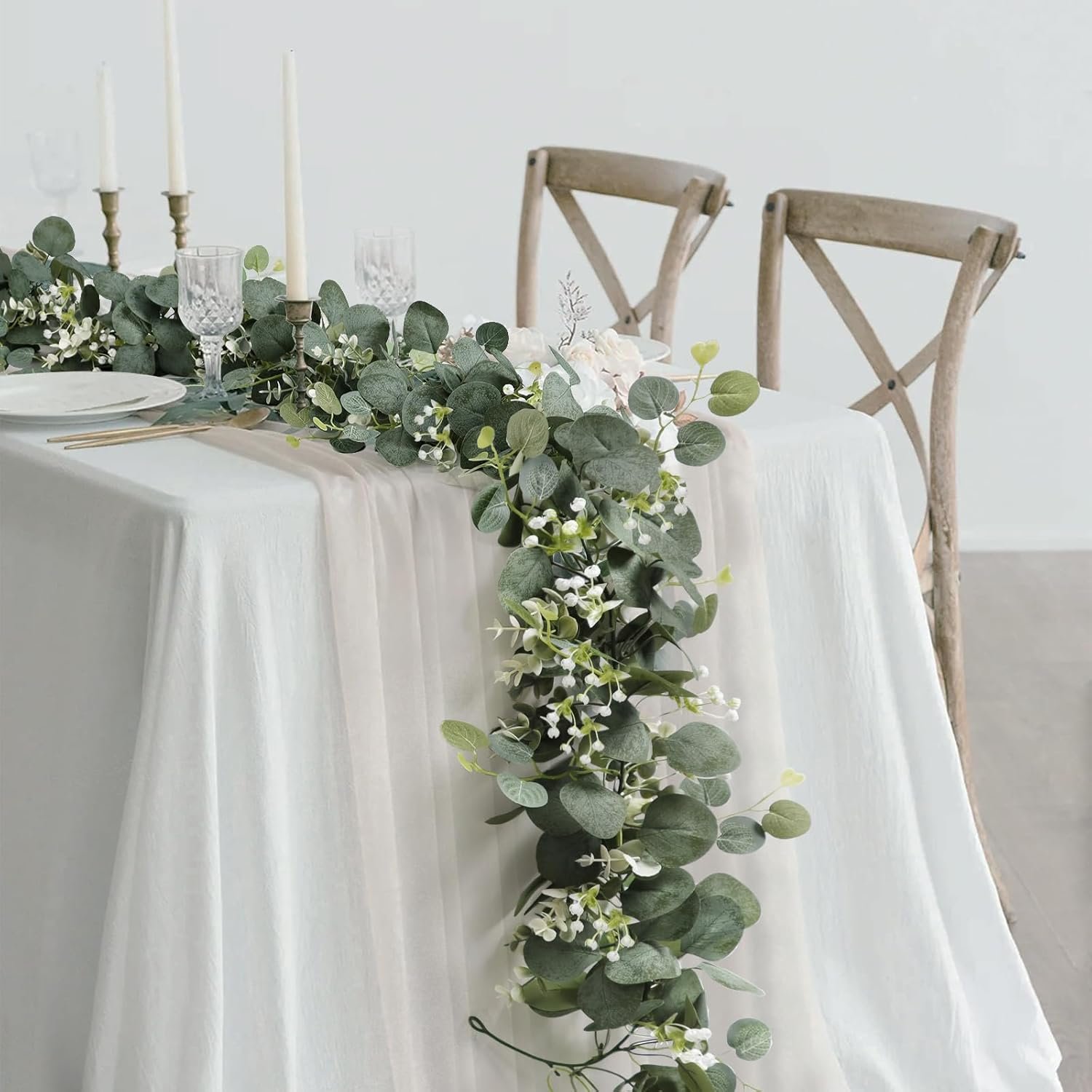
If you prefer lighter aesthetics, an all-cream palette with various textures creates stunning visual interest. Think cream candles, ivory florals, vintage white pottery, and natural linen. The monochromatic approach photographs beautifully and feels incredibly elegant.
The key is choosing three to four colors maximum and repeating them throughout your vignette. This repetition creates cohesion that reads as intentional and polished.

Texture Creates Visual Interest
Texture might be the most underrated element in vignette styling. When I incorporate multiple textures, my vignettes immediately feel more sophisticated and Instagram-worthy.
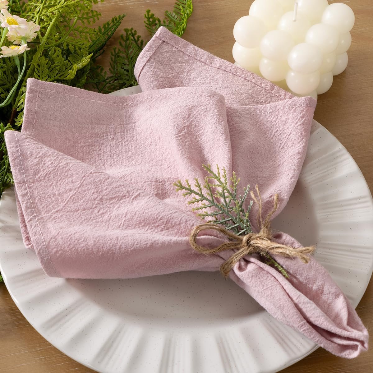
I layer smooth surfaces like glass or ceramic with rough textures like weathered wood or stone. Add soft elements through velvet ribbon, linen napkins, or delicate lace. Natural textures like dried florals, preserved moss, or botanical elements bring organic beauty.
For Valentine’s Day, I love combining smooth marble with rustic wood, soft velvet with crisp linen, and polished brass with natural stone. These contrasts create tactile appeal that translates visually even in photographs.
When light hits different textures, it creates shadows and highlights that add depth to your images. This is what separates amateur styling from those professional-looking shots that perform well on Instagram.

Lighting Makes Everything Better
Let me tell you about the game-changer in my vignette photography. Natural light transforms everything.
I always style my Valentine’s vignettes near windows during golden hour. That soft, warm light streaming through creates the most beautiful, romantic glow. The shadows are gentle rather than harsh, and everything looks dreamy and inviting.
If natural light isn’t available, I use warm-toned artificial lighting positioned to mimic window light. Never use overhead lighting for vignette photography. It creates unflattering shadows and flattens your carefully created dimension.
Candlelight adds magical ambiance to Valentine’s vignette styling. I photograph both with candles lit and unlit to capture different moods. The warm glow creates intimate atmosphere that perfectly suits romantic styling.
Consider backlighting translucent elements like delicate florals or vintage glass. The light filtering through creates ethereal beauty that stops people mid-scroll.

Fresh and Dried Florals
Flowers are essential to Valentine’s vignette styling, but I don’t always use traditional roses. Don’t get me wrong, I love roses, but there’s so much more to explore.
Ranunculus offer incredible texture with their layered petals. They photograph beautifully and come in gorgeous shades from white to deep burgundy. Tulips bring elegant simplicity and work in both modern and vintage-inspired vignettes.
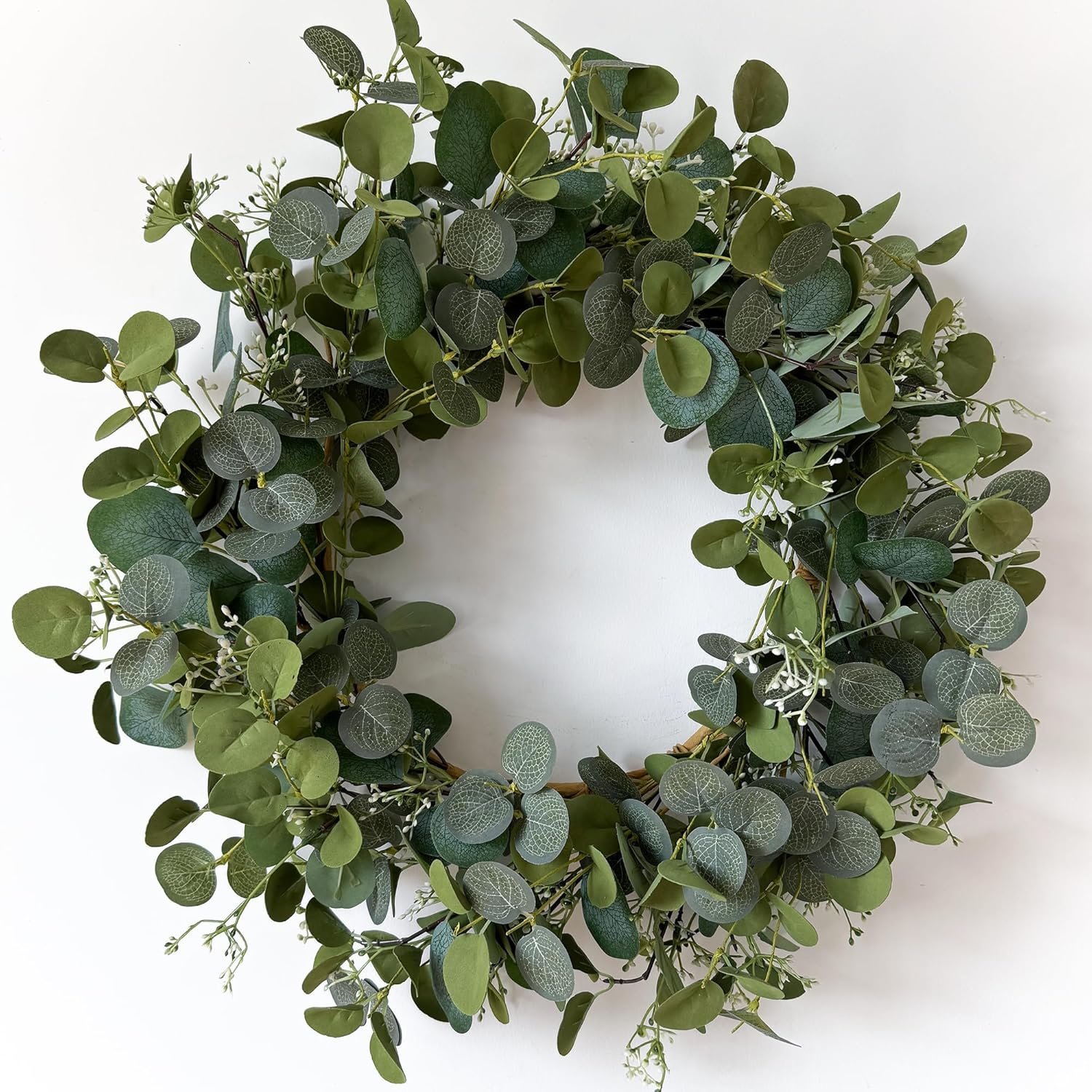
I’m obsessed with incorporating dried elements alongside fresh florals. Dried pampas grass adds height and softness. Preserved eucalyptus brings subtle color and interesting form. Dried lunaria creates delicate, papery beauty that catches light beautifully.
For budget-friendly options, I use grocery store florals and style them in beautiful vintage vessels. A simple bunch of carnations in a French stoneware crock looks absolutely stunning when styled thoughtfully.
The vessel matters tremendously. I collect vintage glass bottles, ceramic crocks, brass vessels, and weathered terracotta pots. These containers add character and story to your vignettes beyond what the flowers alone provide.

Incorporating Personal Touches in Vignette Styling
The vignettes that resonate most on Instagram feel personal and authentic rather than overly staged. I incorporate meaningful objects that tell my story.
Vintage books with beautiful spines add color and height while revealing interests and personality. I display titles that feel romantic or meaningful. Sometimes I open a book to a favorite passage and incorporate it into the styling.
Handwritten notes or vintage love letters add intimate charm. You could include a handwritten recipe card from a grandmother or a meaningful quote written in calligraphy. These personal elements create emotional connection with your audience.
Family photos in vintage frames, inherited jewelry displayed on small dishes, or meaningful keepsakes make your vignettes feel authentic. People respond to real stories more than perfectly styled but impersonal arrangements.
I also love incorporating handmade elements. A small watercolor painting, hand-thrown pottery, or handcrafted candles add artisan quality that elevates the entire vignette.

Balancing Negative Space
Here’s where many people struggle with vignette styling. We tend to add too much rather than editing down to essential elements.
Negative space is crucial for Instagram-worthy styling. It allows the eye to rest and prevents the cluttered appearance that reads poorly in photographs. I intentionally leave empty space around and within my vignettes.
When photographing, this negative space becomes even more important. It gives you room for text overlay if you’re creating graphics. It provides visual breathing room that makes the image feel calm rather than chaotic.
I typically fill only about two-thirds of my available space when styling a vignette. This restraint creates elegance and allows each element to shine rather than competing for attention.
Step back frequently while styling and remove anything that doesn’t serve the overall composition. Sometimes less really is more, especially when creating content for social media.

Creating Movement and Flow
Static vignettes don’t photograph as compellingly as those with visual movement. I create flow by considering how the eye travels through the composition.
Diagonal lines create more interest than horizontal arrangements. I might angle books slightly rather than stacking them perfectly straight. Florals arranged at different heights guide the eye through the vignette.
Cascading elements add beautiful movement. Ribbon trailing from a stack of books, eucalyptus draping over the edge of a tray, or pearls spilling from a vintage box create dynamic interest.
I also think about directional lines created by objects pointing toward focal points. A vintage letter opener might point toward a special photograph. Stems of flowers guide the eye toward a meaningful object.
This deliberate creation of movement makes your vignette styling feel alive and engaging rather than stiff and posed.

Props and Found Objects
My most interesting vignette styling includes unexpected elements that add character and story. I’m constantly sourcing unique props from various places.
Thrift stores offer incredible vintage treasures. Old postcards, vintage valentines, antique medicine bottles, weathered frames, and aged books cost very little but add tremendous visual interest. The patina and wear on vintage items create authentic charm.
Natural elements collected on walks bring organic beauty. Interesting branches, stones, dried seed pods, and moss add texture without cost. These natural finds make vignettes feel grounded and connected to nature.
I save beautiful packaging from gifts. A lovely box from chocolates or a ribbon from a special delivery becomes styling material. These objects carry memories while serving aesthetic purpose.
Hardware stores surprisingly offer great props. Brass findings, vintage-style hooks, and weathered wood pieces add industrial or rustic elements that create interesting contrast in romantic vignettes.

Styling Different Surfaces
The location of your vignette styling significantly impacts its style and how it photographs. I approach different surfaces with specific strategies.
Coffee table vignettes work beautifully with low, horizontal arrangements. I use trays to contain the styling and create boundaries. These vignettes should look beautiful from all angles since coffee tables are viewed from multiple sides.
Console table or entry table vignettes can be taller and more dramatic. These are typically viewed from the front, so I create depth by layering elements front to back. A mirror or artwork behind the vignette adds another dimension.
Floating shelf vignettes require careful balance and scale consideration. I use a combination of leaning frames, standing objects, and hanging elements. These photograph beautifully for Instagram because they create interesting vertical compositions.
Mantel styling allows for symmetrical or asymmetrical arrangements. I often create balance by using similarly weighted but different objects on each side. The height advantage of mantels makes them perfect for dramatic, Instagram-worthy styling.

Photographing Your Vignette Styling
Creating the vignette is only half the work. Capturing it beautifully for Instagram requires some photography knowledge.
I shoot from multiple angles to find the most flattering perspective. Straight-on works well for symmetrical arrangements. Forty-five degree angles create depth and dimension. Overhead shots work beautifully for flat lays and tray styling.
Get close for detail shots that highlight specific elements. These closeups tell part of the story while maintaining mystery. Pull back for context shots that show how the vignette fits into your overall space.
I always shoot in natural light when possible, typically near windows during morning or late afternoon. The soft, directional light creates shadows and highlights that add dimension.
Consider your background carefully. Blurred backgrounds keep focus on your vignette while providing context. Clean, uncluttered backgrounds prevent visual competition with your styling.
Edit your photos consistently to create a cohesive Instagram aesthetic. I typically increase brightness slightly, add a touch of warmth, and enhance contrast without oversaturating colors.

Seasonal Transition Styling
Valentine’s vignette styling doesn’t need to appear overnight on February 1st and disappear on February 15th. I style for gradual seasonal transitions.
Start incorporating romantic elements in late January by adding softer colors and vintage treasures without obvious Valentine’s symbols. This subtle shift feels natural and extends your seasonal content.
After Valentine’s Day, transition by removing overtly themed items while keeping romantic elements. Those blush candles and vintage books work beautifully into early spring. The florals transition perfectly into March styling.
This approach means you’re creating Instagram content over a longer period rather than rushing to capture everything during a short seasonal window.

Making Vignettes Work for You
The most important thing I’ve learned about vignette styling is that it should bring you joy. These aren’t permanent installations requiring perfection.
I change my vignettes frequently, sometimes weekly. This constant evolution keeps my content fresh and gives me endless Instagram material. Don’t be afraid to restyle, reimagine, and recreate.
Start small if you’re new to vignette styling. A simple tray with three elements teaches you about balance, scale, and composition. Add complexity gradually as you build confidence.
Most importantly, let your personal style shine through. The vignettes that perform best on Instagram are those that feel authentic to the creator. Your unique perspective and aesthetic choices are what make your content special.
Valentine’s Day offers the perfect opportunity to practice vignette styling. The romantic theme is forgiving and versatile. Whether you prefer traditional red and pink or sophisticated neutral palettes, there’s room for your interpretation.
Take your time building each vignette. Step back frequently to assess the composition. Photograph from multiple angles. Edit thoughtfully. Share the beauty you’ve created.
These small styled moments become your visual love letter to home, beauty, and the art of intentional living.
If you love home decor and interior design as much as I do, check out these other articles I think you might like.
Best Romantic Outdoor Valentine’s Day Dining Ideas 2026
Best Traditional Red, Pink & White Valentine’s Day Decor 2026
Best DIY Valentine’s Day Centerpieces to Transform Your Table in 2026

