Beyond Orange: Best Sophisticated Fall Color Palettes
When I first started decorating for fall, I fell into the same trap many of us do. Orange pumpkins everywhere. Orange leaves scattered across mantels. Orange, orange, and more orange. But after years of experimenting with seasonal decor, I’ve discovered something wonderful: autumn offers so much more than the traditional orange palette we’re used to seeing.
Fall is actually one of the most sophisticated seasons when it comes to color. Think about it. Nature serves up the most incredible combinations during autumn months. Deep burgundies mix with golden yellows. Rich browns complement sage greens. Warm creams blend beautifully with dusty plums.
I’m going to share my favorite sophisticated fall color palettes that go far beyond orange. These combinations will transform your home into an elegant autumn retreat that feels both seasonal and refined.
If you are looking to add some awesome fall shirts into your wardrobe this year, click on the images below. Use code FALL15 for a 15% discount on top of our current fall price while supplies last. That is a total of 40% OFF!!!! We ship to the USA and Canada.

SHOP THE LOOK!
The Rich Burgundy & Gold Collection
This palette speaks to my soul every fall. Burgundy brings such depth and luxury to a space, while gold adds that perfect touch of warmth. I love using this combination in dining rooms and living spaces where you want to create an intimate, cozy atmosphere.
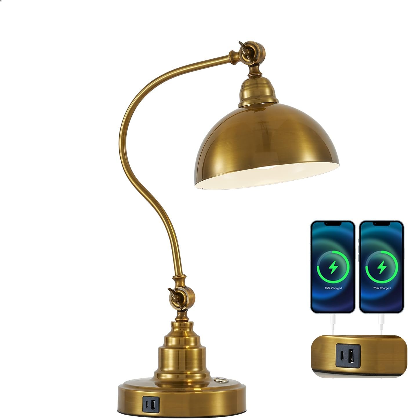
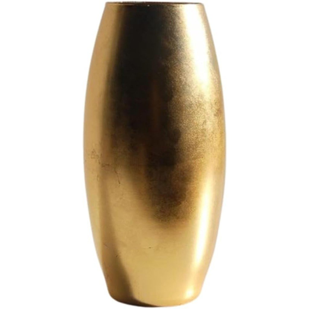
Start with deep burgundy as your anchor color. Think wine-colored throw pillows, rich velvet curtains, or a stunning burgundy accent wall. Then layer in gold through metallic accessories, picture frames, and lighting fixtures.
The magic happens when you add in complementary neutrals. Cream and ivory soften the intensity of the burgundy while allowing the gold to shine. I often incorporate natural wood tones too, which bridge the gap between the rich jewel tones and lighter neutrals perfectly.
For textiles, consider mixing different textures. A burgundy velvet throw looks stunning against cream linen pillows. Gold silk cushions add glamour when paired with a chunky knit burgundy blanket. The contrast in textures makes this palette feel dynamic and interesting.

SHOP THE LOOK!
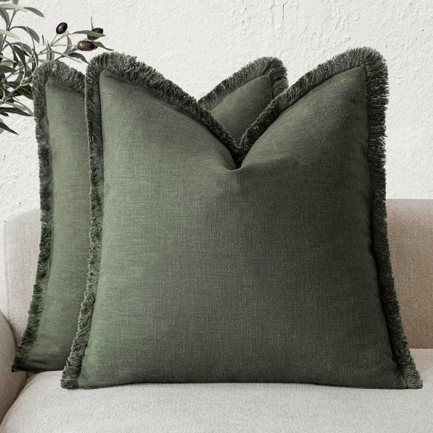
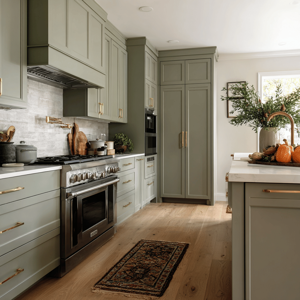
Sage Green & Warm Taupe Harmony
Here’s a palette that surprises people. Sage green might not scream “fall” at first glance, but it’s actually one of autumn’s most sophisticated colors. When paired with warm taupe tones, it creates a calming, spa-like atmosphere that still feels perfectly seasonal.
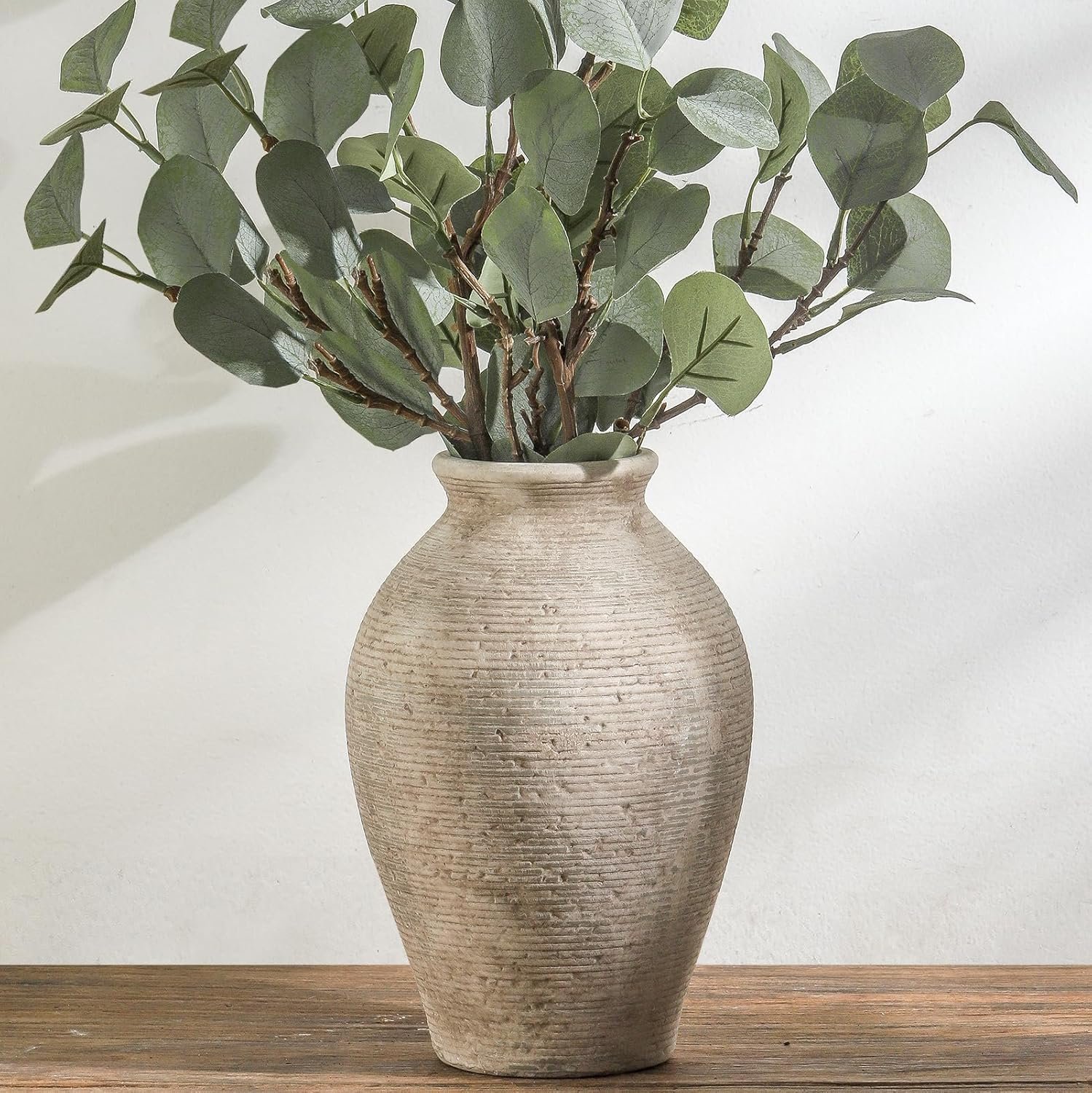
I discovered this combination while trying to create a fall look that wouldn’t clash with my existing neutral decor. Sage green works beautifully because it echoes the muted greens found in autumn landscapes – those silvery eucalyptus branches and dried moss colors you see in nature.
Warm taupe serves as the perfect complement to sage green. It’s more interesting than basic beige but still neutral enough to work with almost any existing color scheme. I love using warm taupe on larger surfaces like walls or major furniture pieces, then bringing in sage green through accessories and accent pieces.
This palette works especially well in bedrooms and bathrooms where you want a serene, restful feeling. Add in some natural wood elements and perhaps a touch of cream, and you’ve got a fall palette that feels both sophisticated and timeless.
SHOP THE LOOK!
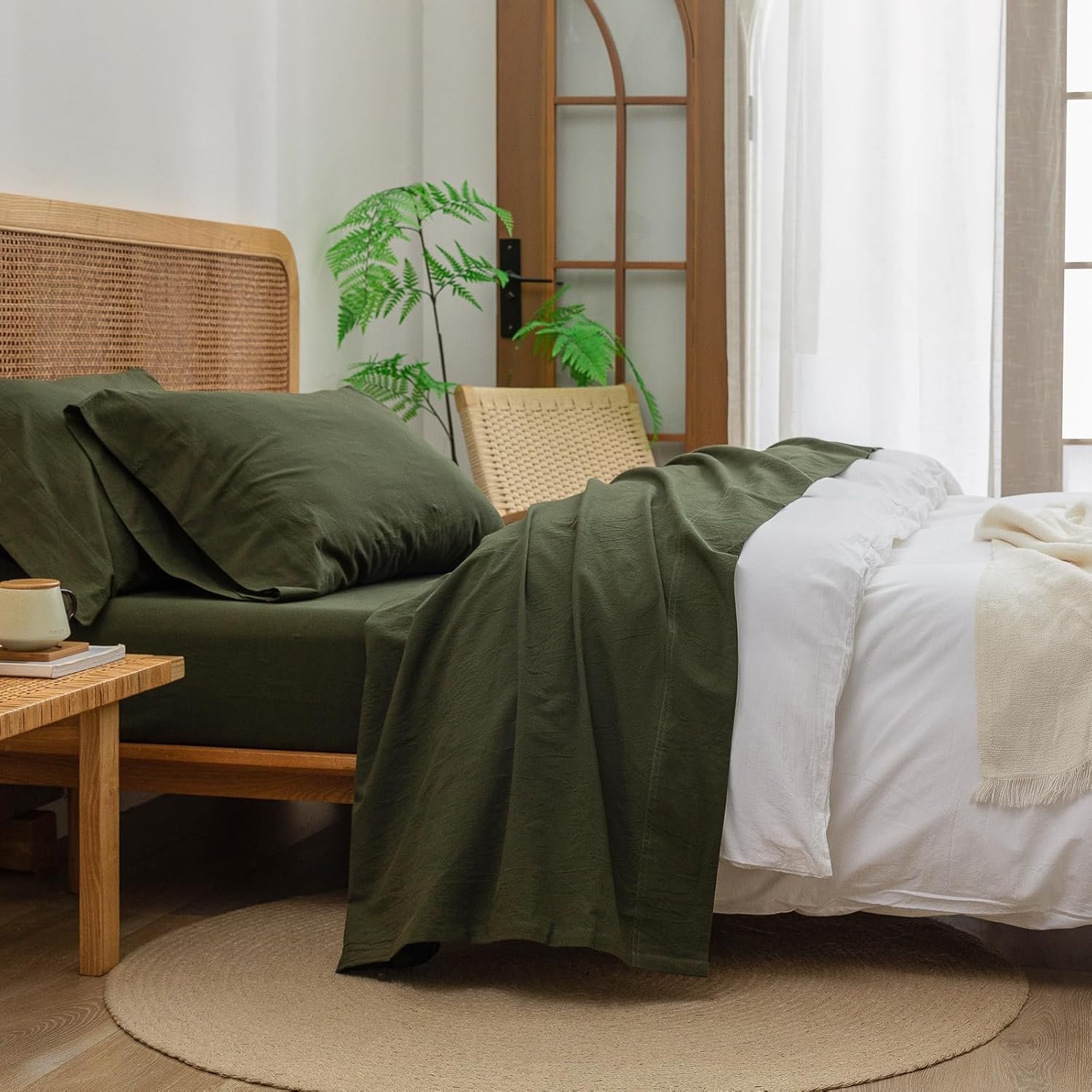
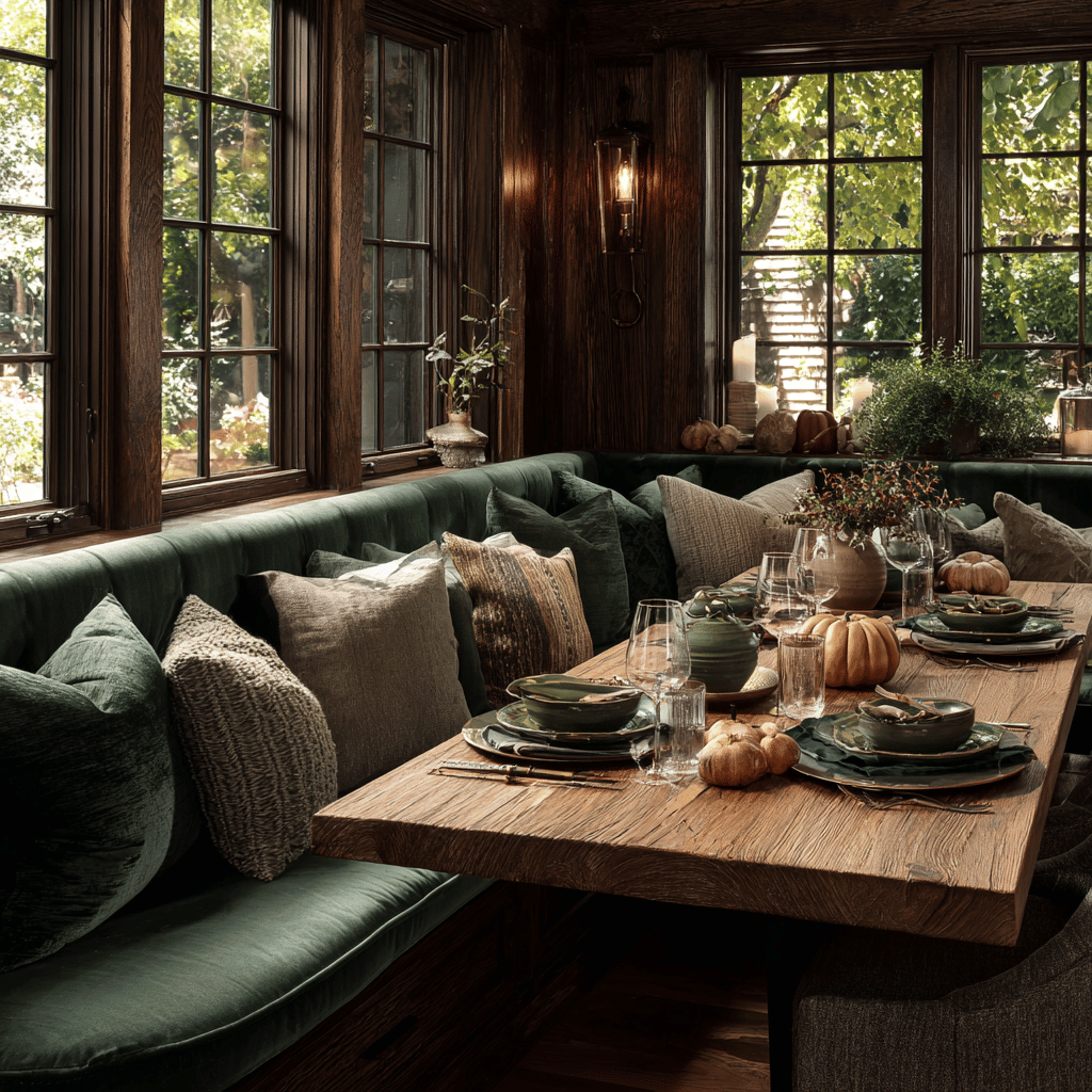
Deep Forest & Mushroom Magic
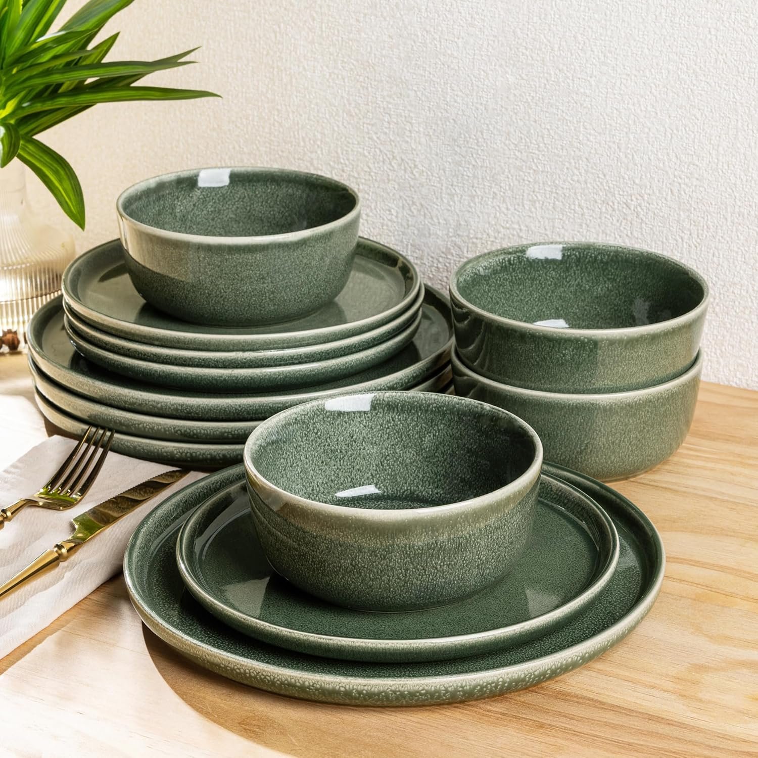
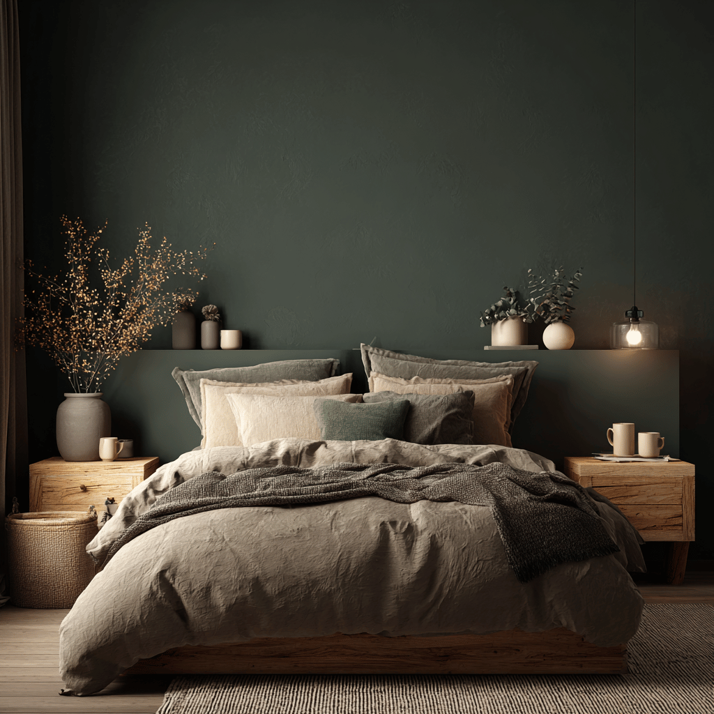
Nothing says autumn elegance quite like deep forest green paired with mushroom tones. This earthy combination brings the outdoors in without looking rustic or casual. It’s refined, grounded, and absolutely perfect for fall.
Deep forest green is such a rich, complex color. It has enough depth to feel dramatic but enough earthiness to remain approachable. I use it as a statement color – perhaps on built-in bookcases, as an accent wall, or through major textile pieces like curtains or upholstery.
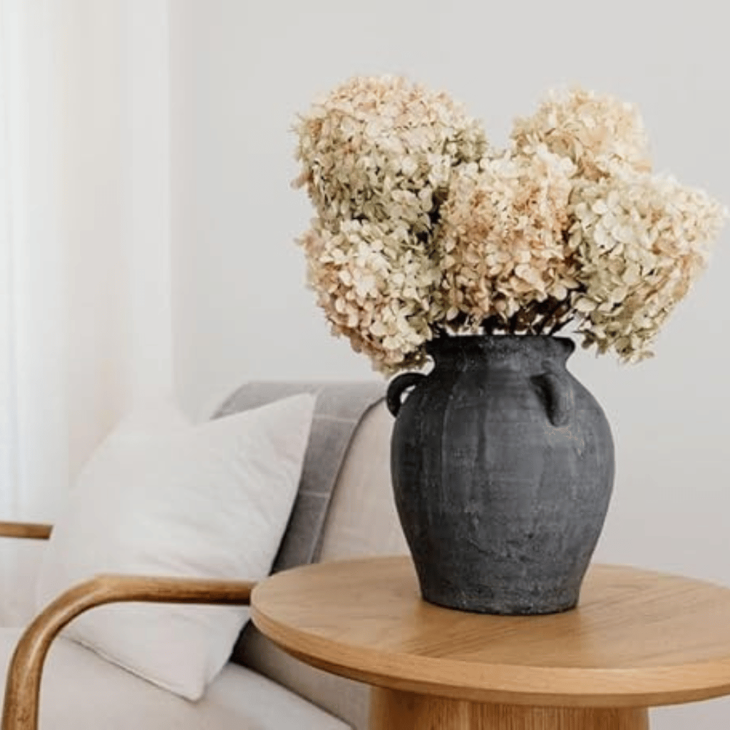
Mushroom tones are where this palette gets really interesting. These aren’t your basic browns. Think more along the lines of soft grays with warm undertones, creamy beiges with hints of pink, or dusty taupes that change in different lighting. These colors add sophistication and prevent the green from feeling too bold or overwhelming.
The beauty of this combination lies in its versatility. You can make it more dramatic by adding deeper mushroom tones, or keep it light and airy with lighter, creamier mushroom shades. Both approaches work wonderfully for fall decorating.
SHOP THE LOOK!
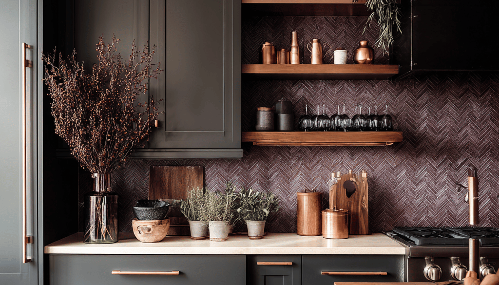
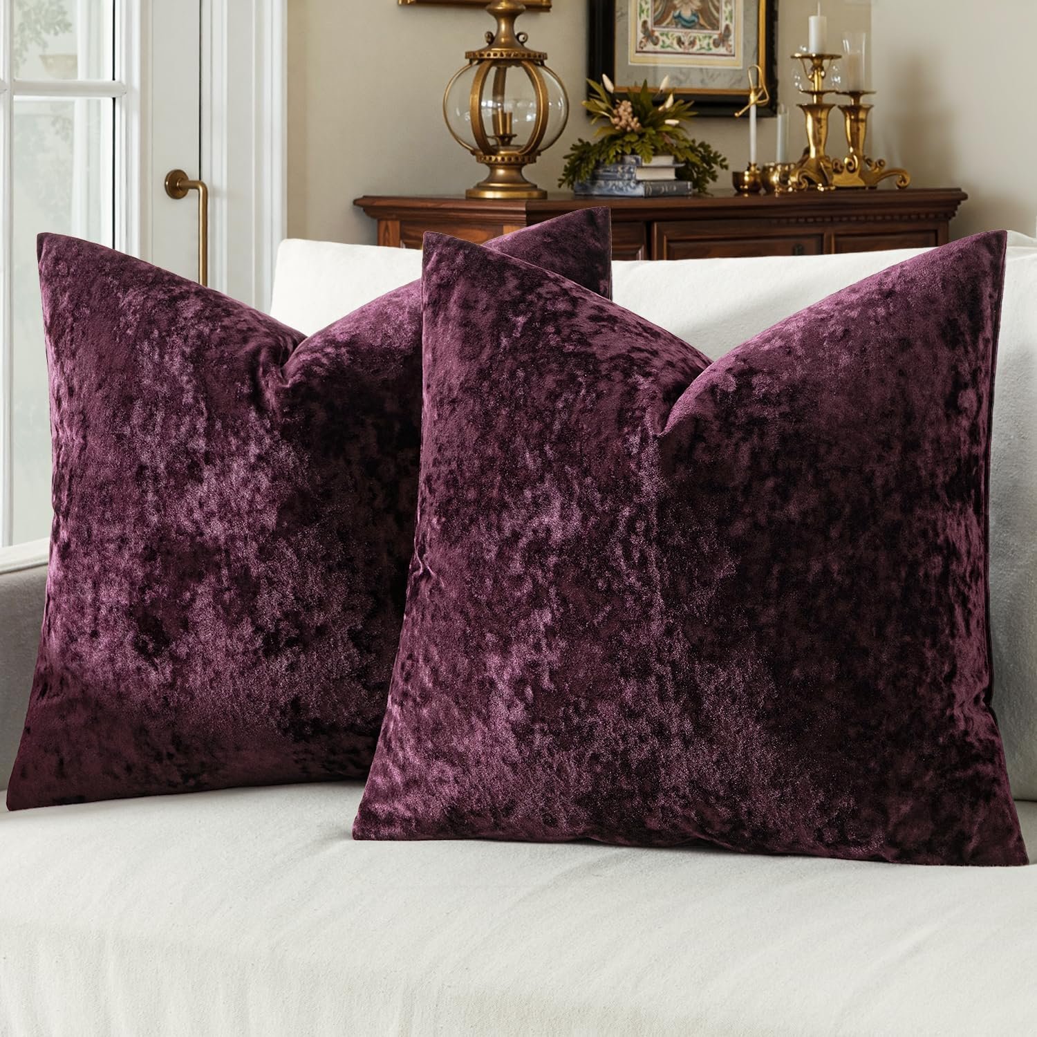
Plum & Charcoal Sophistication
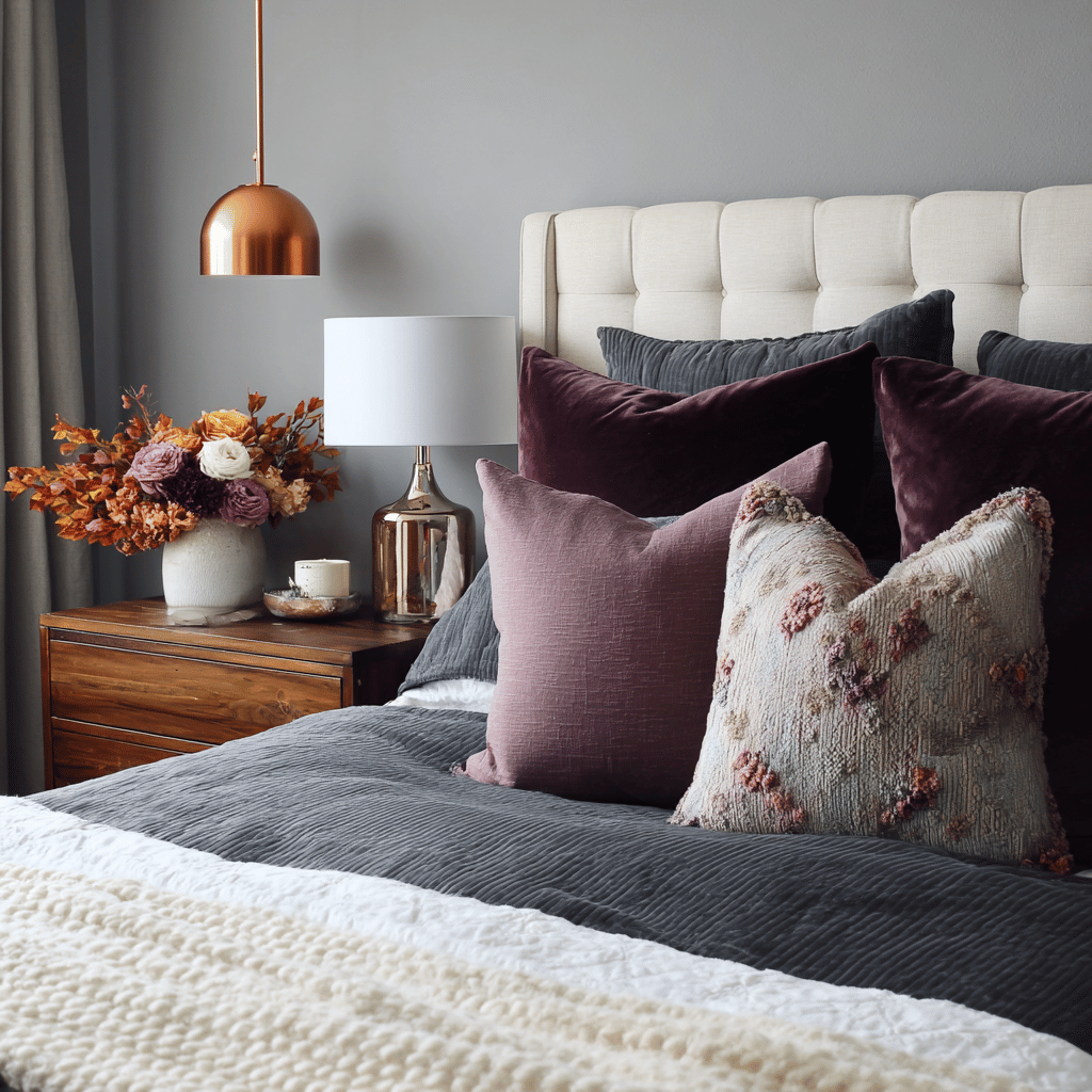
For those who love a more dramatic approach to fall decorating, plum and charcoal create an incredibly sophisticated palette. This combination feels modern and elegant while still capturing the richness of autumn.
Plum is such an underutilized fall color. It has all the warmth and richness you want for autumn, but it’s far more unique than the typical orange and red combinations everyone else is using. When you pair it with charcoal gray, you get a palette that feels both cozy and contemporary.
I love using charcoal as the dominant neutral in this scheme. It’s more interesting than black but still provides that sophisticated contrast that makes plum really pop. Think charcoal throw pillows, area rugs, or even painted furniture pieces.
The key to making this palette work is balancing the intensity. If you use too much plum, the space can feel overwhelming. Instead, use plum as an accent color and let charcoal do most of the heavy lifting. Add in some cream or warm white to prevent the space from feeling too dark.
SHOP THE LOOK!
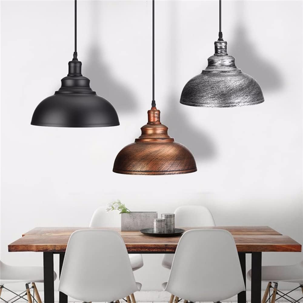
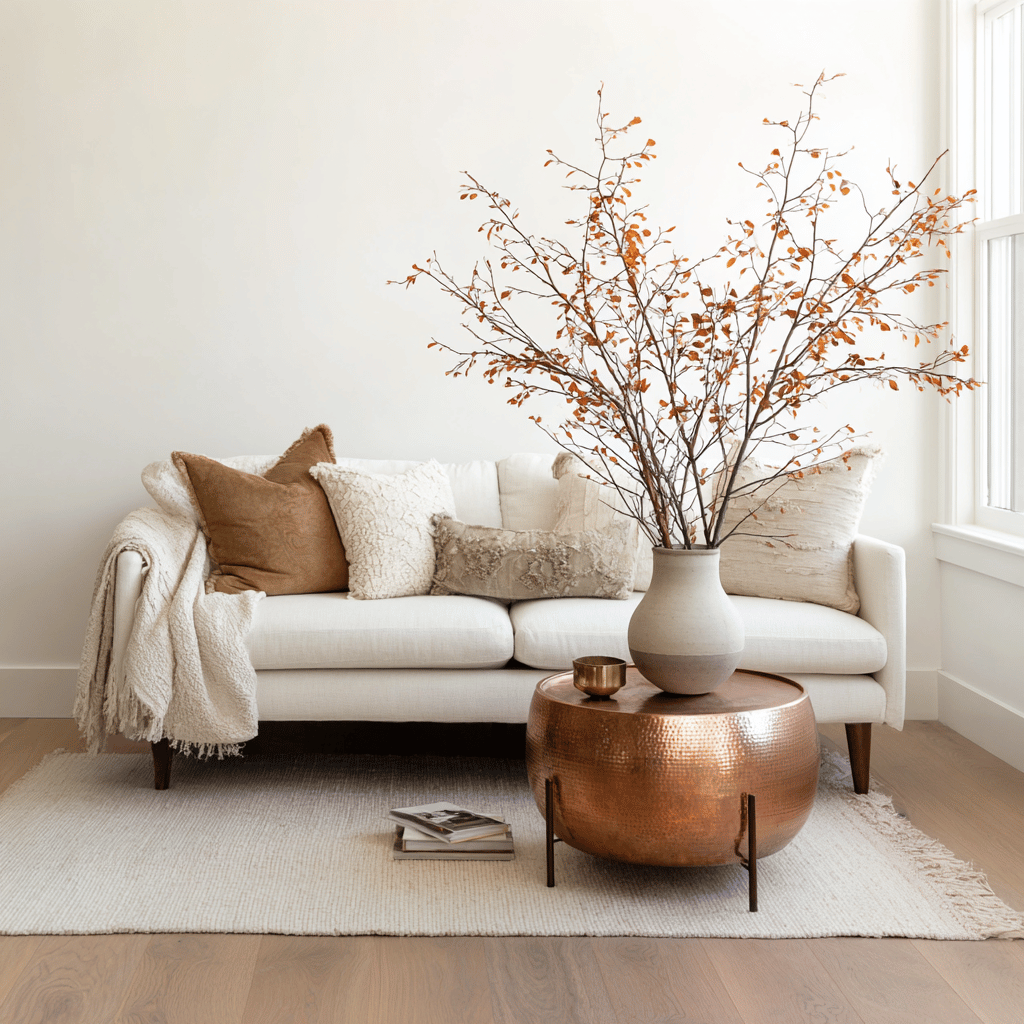
Warm Neutrals with Copper Accents
Sometimes the most sophisticated approach is the most subtle one. A palette built around warm neutrals with strategic copper accents creates a fall feeling that’s elegant and understated.
This is my go-to palette for clients who want their homes to feel seasonal without making major changes. Start with your existing neutral base – whether that’s cream, beige, or warm gray – and simply add in copper elements for that perfect fall touch.
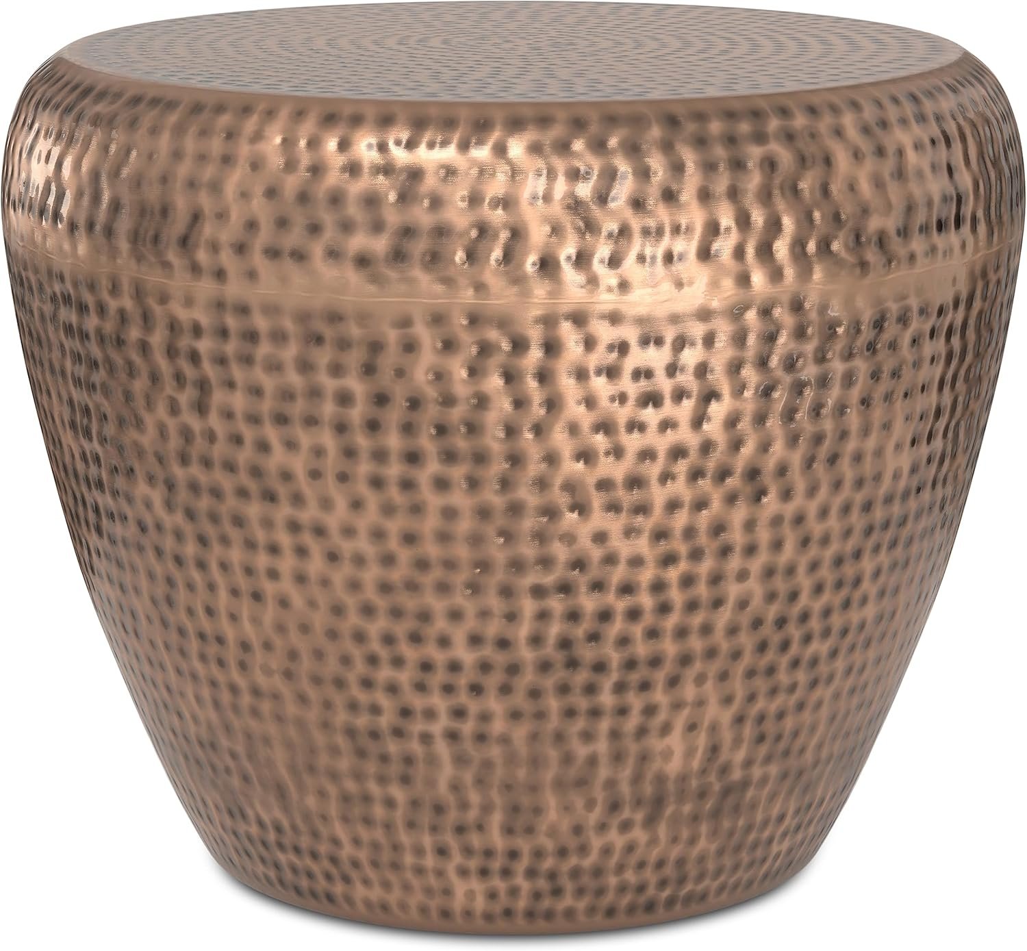
Copper is having such a moment right now, and for good reason. It’s warmer than silver but more refined than gold. It brings just enough color to feel seasonal without being overwhelming. I love incorporating copper through lighting fixtures, picture frames, vases, and decorative objects.
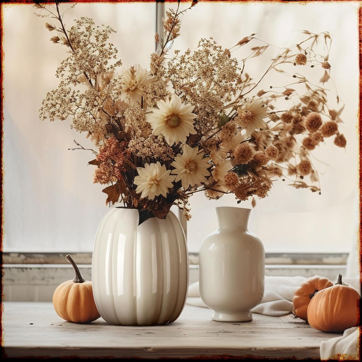
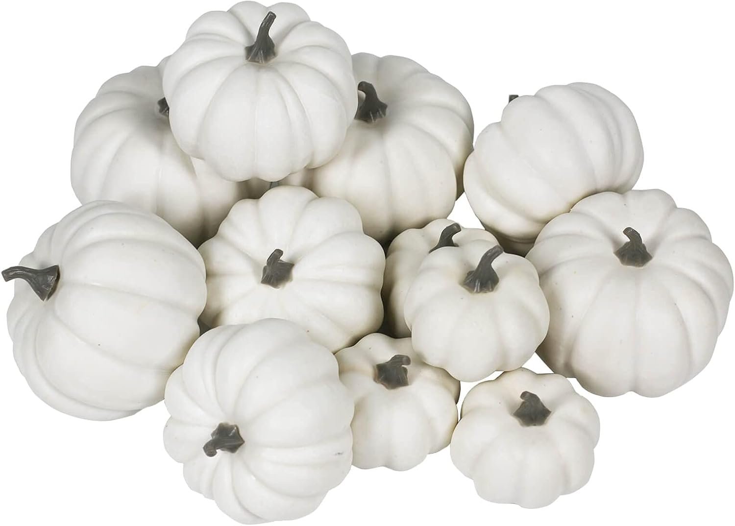
The beauty of this palette is its flexibility. You can add seasonal elements like pumpkins and gourds, but choose them in cream, white, or natural tones rather than bright orange. The result is fall decorating that feels grown-up and sophisticated.
SHOP THE LOOK!
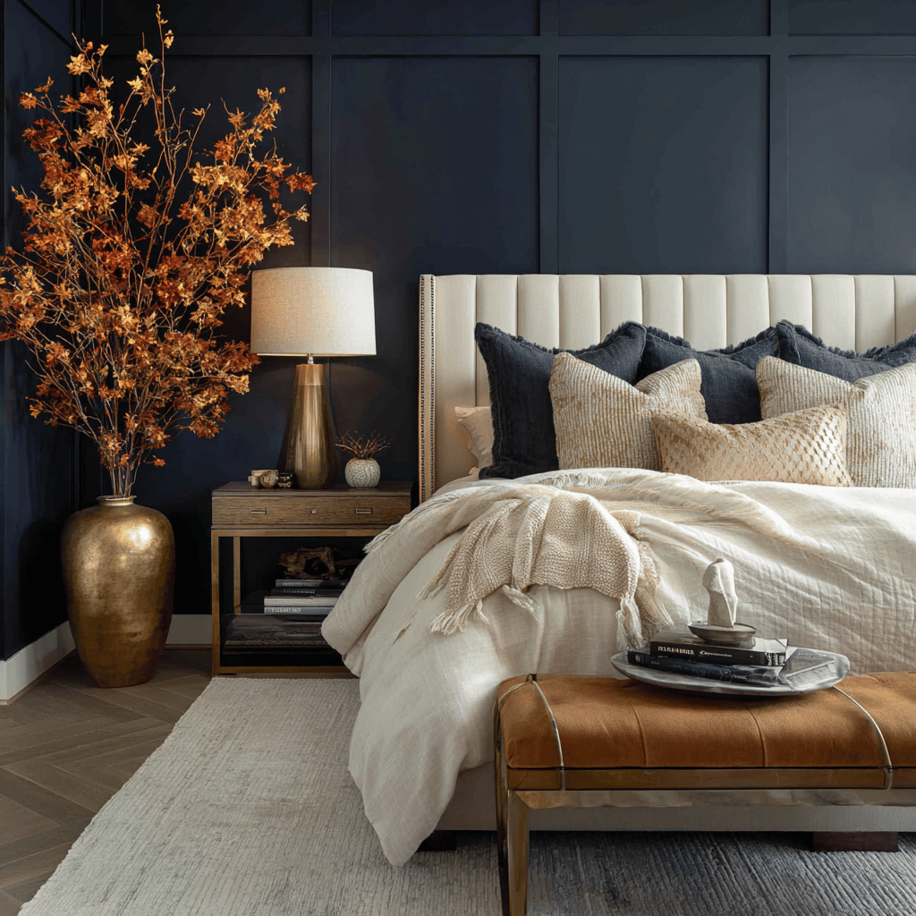
Navy & Camel Classic Combination
Here’s a palette that works year-round but feels especially perfect for fall. Navy and camel create such a classic, timeless combination that never goes out of style. It’s preppy without being stuffy, and sophisticated without being pretentious.
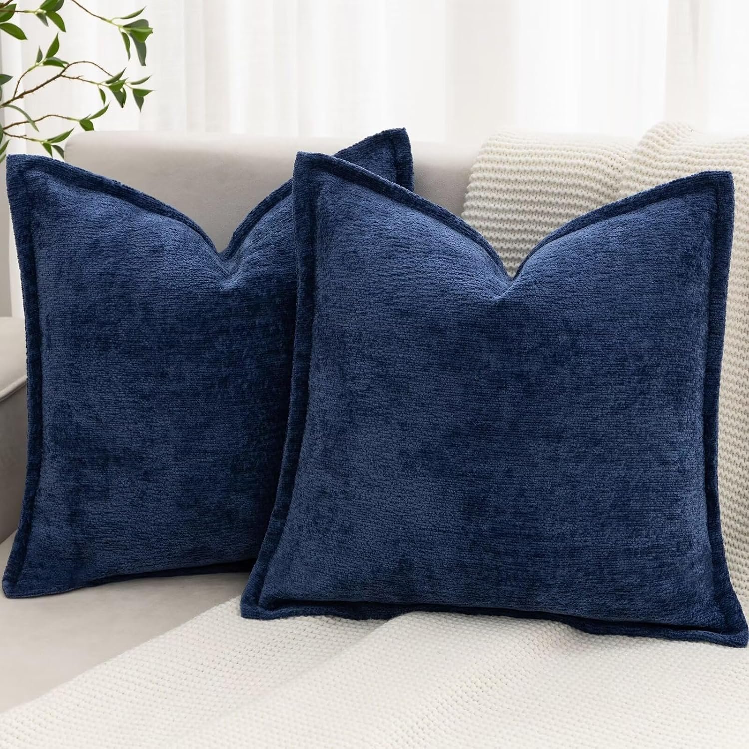
Navy serves as your rich, deep color – similar to how burgundy or forest green work in other fall palettes. But navy has this wonderful versatility that makes it work with so many different decorating styles. Whether your home is traditional, modern, or somewhere in between, navy can work.
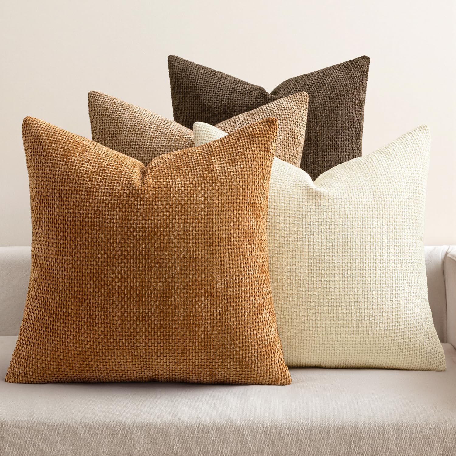
Camel brings warmth and richness that perfectly complements navy’s coolness. Think camel-colored leather furniture, wool throws, or ceramic accessories. The combination of navy’s depth and camel’s warmth creates such a cozy, inviting atmosphere.
This palette works especially well in family rooms and home offices where you want a feeling of both comfort and professionalism. Add in some cream and natural wood tones, and you have a fall palette that feels both seasonal and sophisticated.
SHOP THE LOOK!
Tips for Implementing Sophisticated Fall Palettes
Now that I’ve shared my favorite sophisticated fall color combinations, let me give you some practical tips for implementing them in your own home.
Start small if you’re nervous about color. You don’t need to repaint entire rooms or buy new furniture to create these looks. Begin with throw pillows, blankets, and small accessories. These items are relatively inexpensive and easy to change out as seasons shift.
Layer your colors thoughtfully. The most sophisticated color palettes have depth and complexity. This means using different shades and tones within your chosen color family. If you’re working with the burgundy and gold palette, for example, don’t just use one shade of burgundy. Mix deep wine tones with lighter cranberry shades for more visual interest.
Pay attention to texture as much as color. Sophisticated fall decorating is about more than just the right colors – it’s about how those colors feel. Mix smooth and rough textures, shiny and matte finishes, light and heavy materials. This creates depth and keeps your palette from feeling flat or boring.
Don’t forget about lighting. The way colors look changes dramatically depending on the lighting in your space. Warm, soft lighting enhances the cozy feeling of fall palettes, while harsh fluorescent lights can make even the most sophisticated colors look cheap and uninspiring.
Consider the existing elements in your room. The most successful color palettes work with what you already have rather than fighting against it. If you have cool-toned furniture, choose fall palettes that incorporate cooler colors like sage green or charcoal. If your existing pieces are warm-toned, lean toward palettes with burgundy, gold, or warm neutrals.
SHOP THE LOOK!
Making It Personal
The best part about moving beyond orange in your fall decorating is that you can choose palettes that truly reflect your personal style. Love minimalist design? The warm neutrals with copper accents might be perfect for you. Prefer dramatic, moody spaces? Try the plum and charcoal combination.
I’ve found that the most sophisticated fall decorating happens when you choose colors that you genuinely love, not just colors that feel “fall-appropriate.” These sophisticated palettes give you permission to create autumn decor that feels authentically you while still capturing the season’s warmth and richness.
Remember, fall decorating should make you happy every time you walk into your home. It should feel like a warm hug at the end of a crisp autumn day. These sophisticated color palettes help you create that feeling without relying on the same tired orange combinations everyone else is using.
This fall, I encourage you to think beyond orange. Embrace the sophisticated color combinations that autumn naturally provides. Your home will feel more elegant, more personal, and more welcoming as a result. And isn’t that what the best fall decorating is really about?
If you love home decor and interior design as much as I do, check out these other articles I think you might like.
Best Fall Coastal Decor: Bringing Autumn Warmth to Your Beach Home

