Best Summer Color Palette: Using This Year’s Trending Hues
Summer is finally here, and with it comes a fresh wave of vibrant colors that are dominating the design world. I’ve been watching these trends develop over the past few months, and I’m excited to share how you can incorporate this season’s most stunning hues into your home. Whether you’re planning a complete makeover or just want to refresh your space with a few seasonal touches, this guide will help you navigate the summer color palette with confidence.

This Season’s Color Story: Fresh, Bold, and Nature-Inspired
Every year brings its own color narrative, but this summer feels particularly special. The palette we’re seeing emphasizes connection with nature while balancing serene tones with unexpected pops of energy. After spending time researching industry forecasts and visiting several design showcases, I’ve identified the key color trends that are making the biggest impact.
The season’s palette draws heavily from natural elements – think sun-bleached terraces, crystal-clear coastal waters, and lush botanical gardens. But there’s also an undeniable influence from the optimistic design movements gaining momentum on social media and in high-end interior magazines.
Color is the most immediate way to transform a space. This summer’s palette offers something for everyone, from the color-shy to the boldest maximalists.
The Core Summer Color Palette
Let’s break down the specific hues that are defining this season:
1. Mediterranean Blue
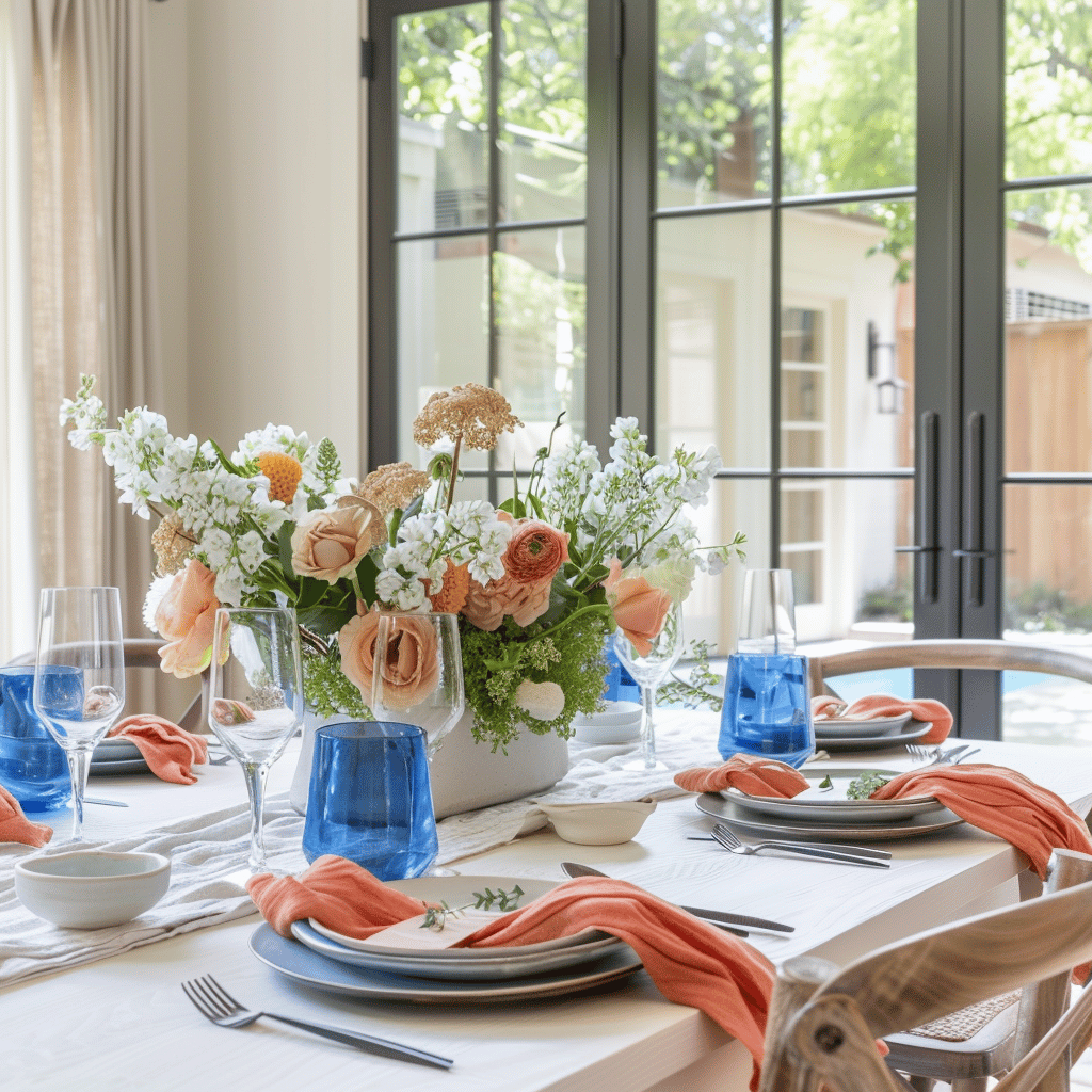
This isn’t just any blue – it’s a specific shade that sits between cobalt and cornflower, with enough depth to anchor a space but enough brightness to feel distinctly summery. I’ve noticed this shade appearing everywhere from ceramic tableware to statement furniture pieces.
The beauty of Mediterranean Blue lies in its versatility. It pairs beautifully with neutrals for a classic coastal look, but also creates stunning combinations with terracotta, mustard, or even a contrasting citrus tone for something more unexpected.
In my own living room, I’ve introduced this color through cushions and a new ceramic lamp base, which immediately refreshed the entire space without requiring a complete redesign.
2. Sunset Terracotta
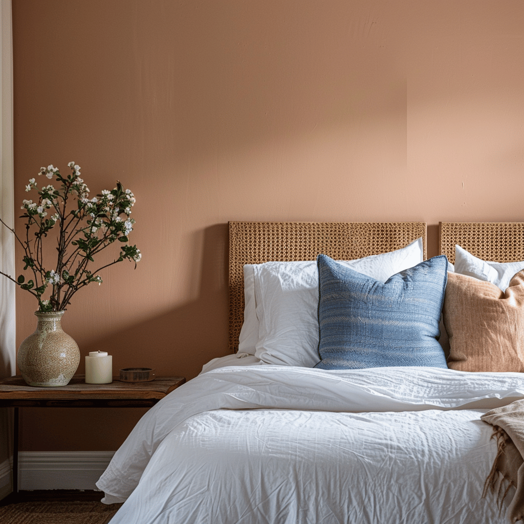
Moving away from the cooler burnt oranges of previous seasons, this year’s terracotta leans warmer and earthier. It carries hints of adobe houses baking in the summer sun and brings an immediate sense of warmth to any space.
What makes Sunset Terracotta so appealing is how it bridges traditional and contemporary design. I’ve seen it used effectively in both minimalist apartments and more eclectic, bohemian spaces.
This color works particularly well on textured surfaces – think ribbed vases, woven textiles, or even a painted feature wall with subtle texture. The dimensional quality helps to showcase the richness of the pigment and prevents it from feeling flat.
3. Citron Yellow
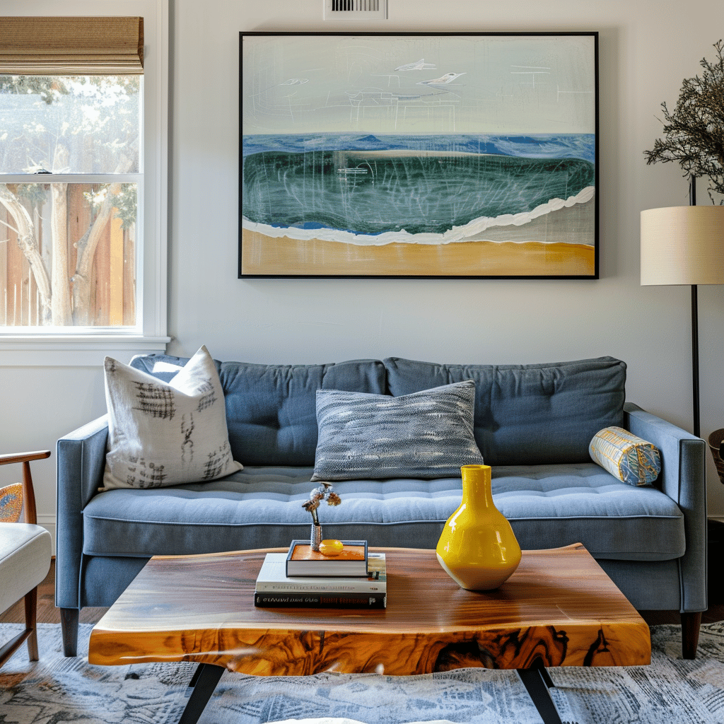
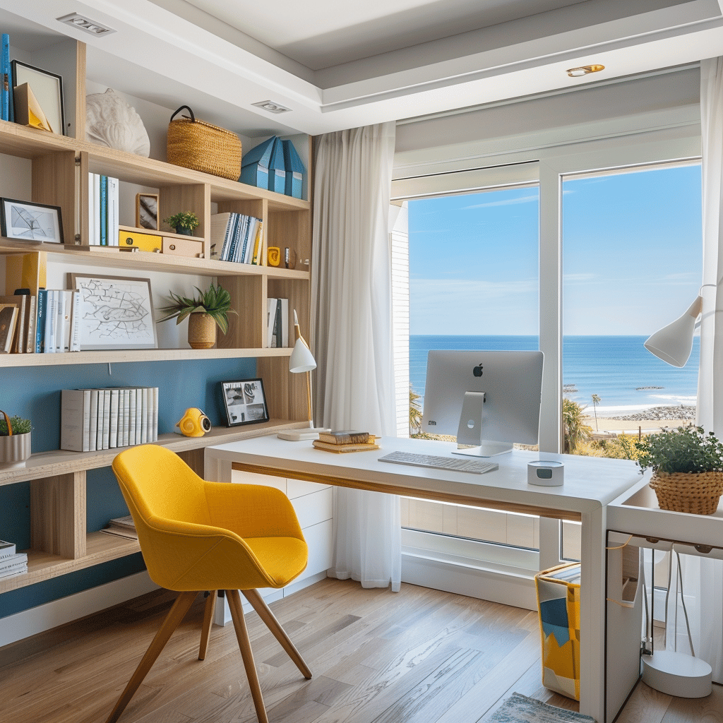
Perhaps the most energetic addition to this year’s palette, Citron Yellow offers a perfect balance between lemon brightness and a slightly softened edge that makes it livable. It’s not quite pastel, but it’s not harshly neon either.
I was initially hesitant about this color – yellow can be notoriously difficult to get right. But after experimenting with it in my home office through some new desk accessories and artwork, I’m completely converted. It brings an instant mood lift to any space it occupies.
The key to using Citron Yellow effectively is moderation. A little goes a remarkably long way, especially when paired with natural materials like rattan, jute, and light woods that help ground its vibrant energy.
4. Sage Revival
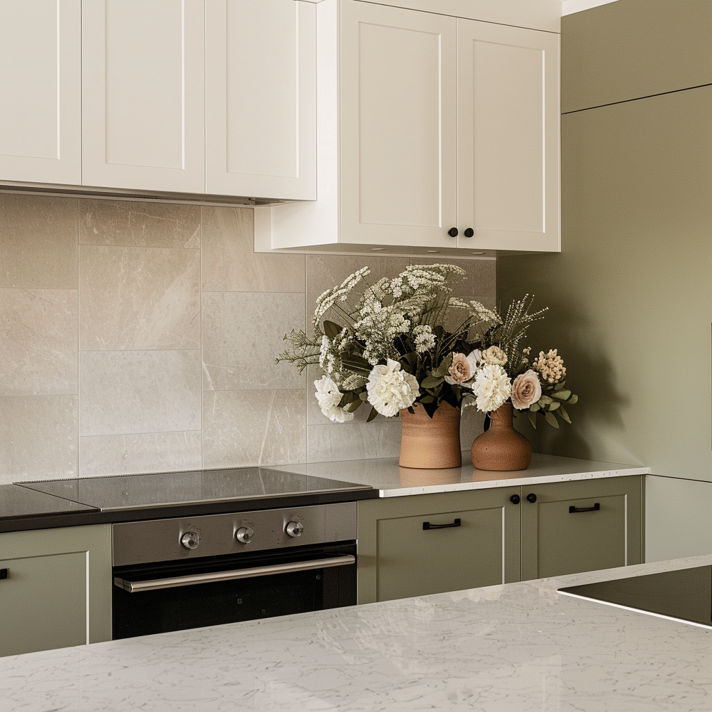
Green continues its reign in interior design, but this summer we’re seeing a specific revival of sage tones. Unlike the sometimes-too-muted sages of past years, this iteration has a bit more life to it – imagine garden herbs bathed in warm morning light.
What I love about this updated Sage is how it functions almost as a new neutral. I’ve successfully paired it with every other color in this season’s palette, making it an incredibly versatile choice for larger pieces or background elements.
It also makes an excellent transitional color if you’re not ready to fully commit to some of the bolder hues in this season’s mix. I recently helped a color-shy friend update her dining room by painting just one wall in this refreshed sage, and it completely transformed the space while still feeling comfortable and approachable.
5. Coral Blush
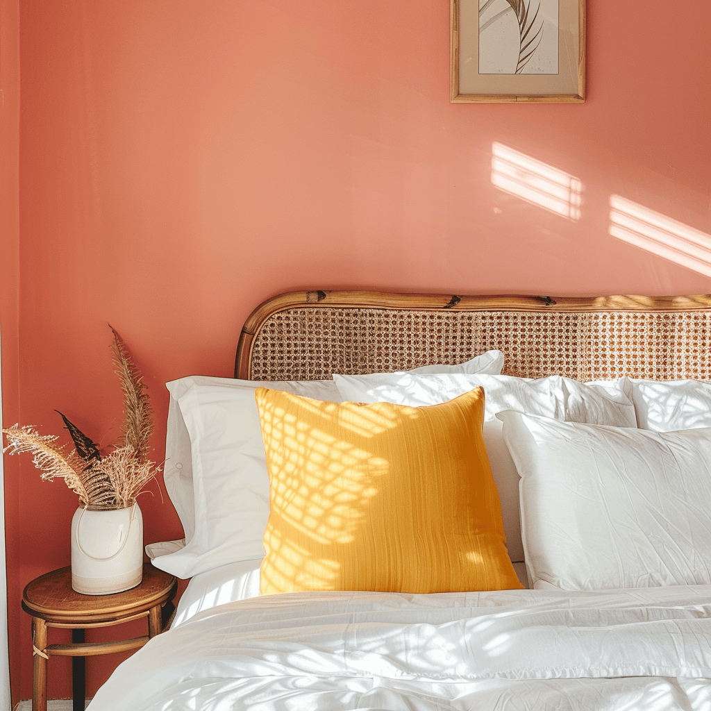
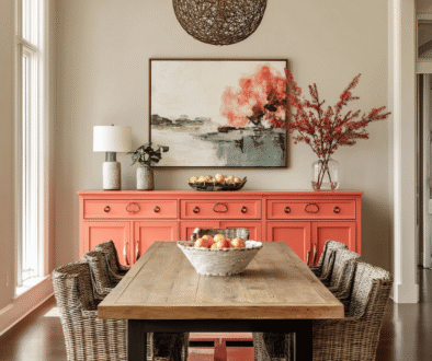
Completing our core palette is a sophisticated Coral Blush that feels considerably more grown-up than the coral tones we’ve seen in previous years. There’s a dusty quality to it that prevents it from skewing too youthful or overtly feminine.
This color brings a wonderful warmth to spaces that might otherwise feel cool, particularly when used alongside the Mediterranean Blue or Sage Revival. I’ve found it particularly effective in north-facing rooms that need that extra touch of warmth.
What’s particularly interesting about this year’s Coral Blush is its chameleon-like quality – it reads differently depending on what you pair it with. Next to neutrals, it feels subtle and sophisticated; alongside more vibrant colors, it holds its own with surprising strength.
Creating Combinations That Work
Now that we’ve explored the individual colors, let’s talk about how to combine them effectively. Color pairing is where the magic really happens, and getting it right can be the difference between a space that feels professionally designed and one that doesn’t quite come together.
The 60-30-10 Rule
When working with multiple colors, I always recommend following the 60-30-10 rule as a starting point. This means:
- 60% of your space features your dominant color (often a more neutral tone)
- 30% showcases your secondary color
- 10% is reserved for accent colors
Using our summer palette, you might choose Sage Revival as your 60% color (on walls or larger furniture pieces), Mediterranean Blue as your 30% color (perhaps on a sofa or set of dining chairs), and Citron Yellow as your punchy 10% (in artwork, cushions, or decorative objects).
This formula isn’t rigid, but it provides a helpful framework for creating balance. I’ve used it countless times in my own home and when helping friends redesign their spaces.
Unexpected Pairings to Try
While traditional color theory can guide us, some of the most interesting interiors come from unexpected combinations. Here are a few surprising pairings from this summer’s palette that I’ve found remarkably successful:
- Sunset Terracotta + Citron Yellow: While both are warm colors, they sit far enough apart on the color wheel to create a vibrant, energetic combination that feels particularly appropriate for dining spaces or areas meant for entertaining.
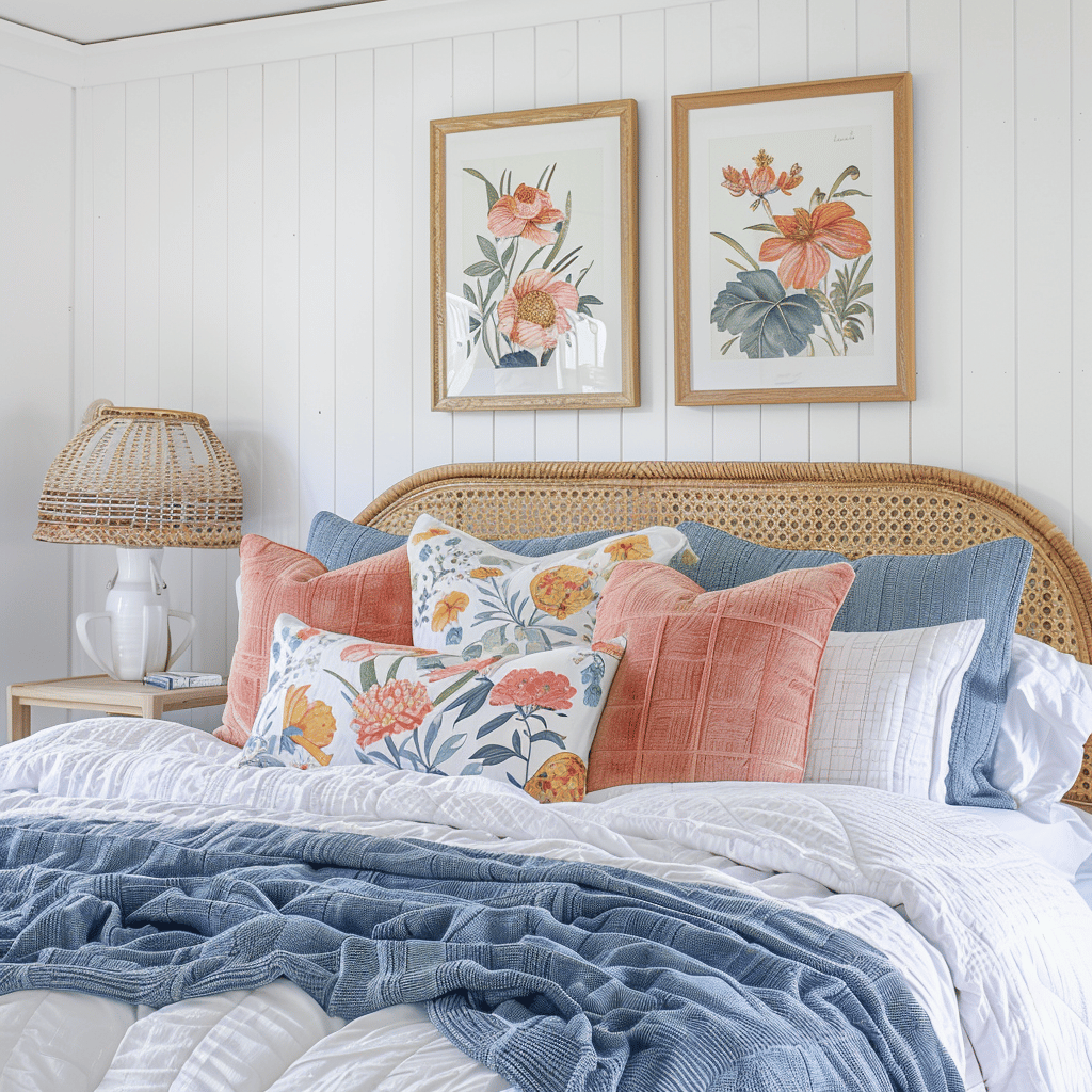
- Mediterranean Blue + Coral Blush: This pairing creates a perfect tension between cool and warm. I recently used this combination in a bedroom design, with the blue on walls and the coral appearing in bedding and artwork, creating a space that felt both calming and inviting.
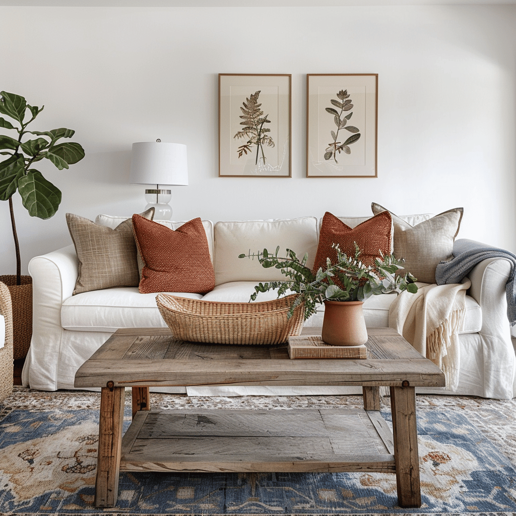
- Sage Revival + Sunset Terracotta: This earth-inspired combination has quickly become one of my favorites for living spaces. The coolness of sage balances the warmth of terracotta beautifully, creating an environment that feels grounded yet fresh.
Room-by-Room Application
Different spaces in your home serve different purposes, and the color palette should reflect this. Let’s explore how to apply this summer’s trending hues throughout your home.
Living Room
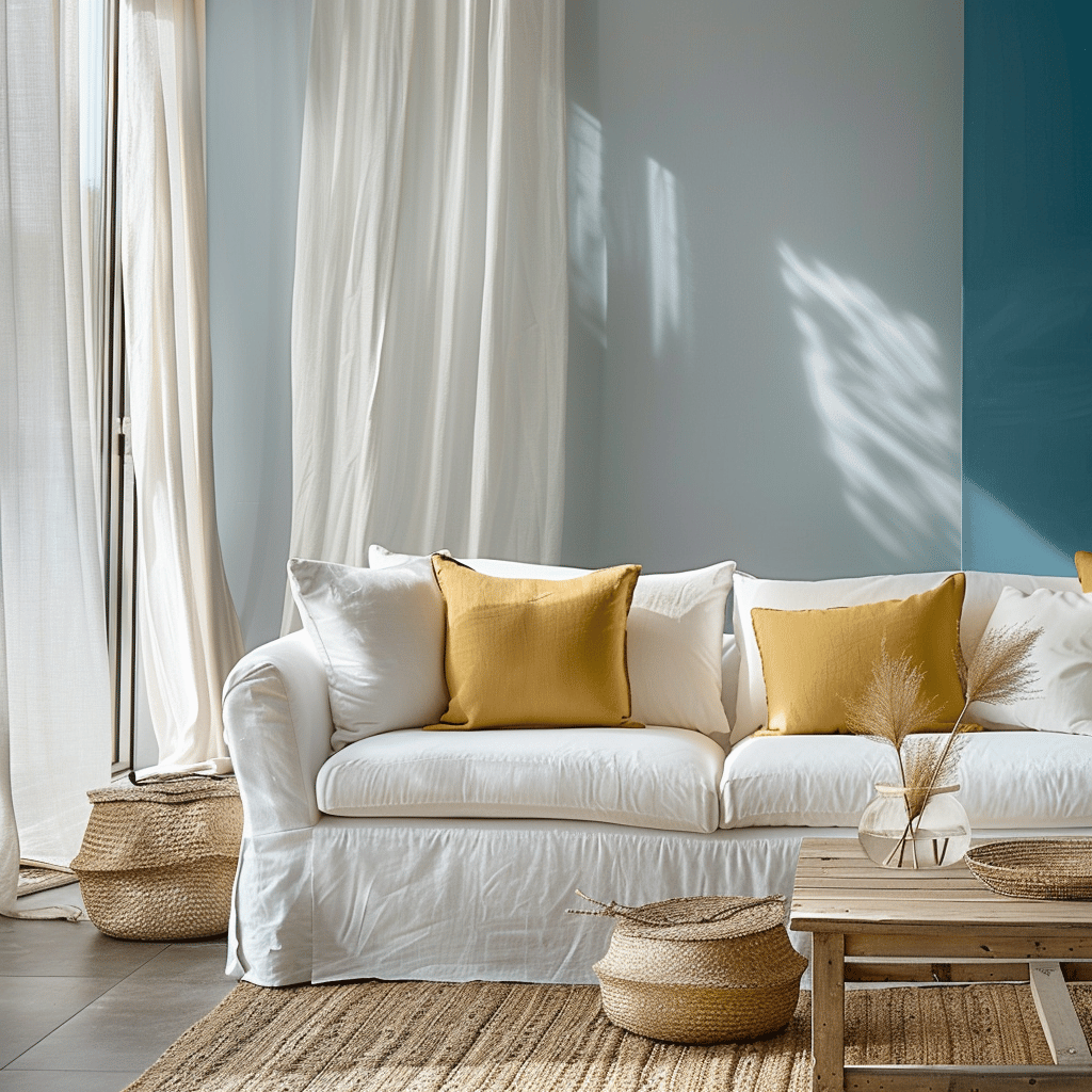
The living room typically serves as both relaxation space and entertainment hub, so versatility is key. I’ve found that using Sage Revival or Mediterranean Blue as foundational colors works beautifully here. Either can be introduced through wall color if you’re feeling bold, or through larger furniture pieces if you prefer to keep walls neutral.
Then, layer in Sunset Terracotta through mid-sized elements like accent chairs, ottomans, or substantial textiles. Complete the look with small doses of Citron Yellow and Coral Blush through accessories that can be easily switched out when seasons change.
In my own living room, I kept my neutral sofa but introduced Mediterranean Blue through a new area rug, added terracotta-toned cushions, and finished with brass accessories that complement the Citron Yellow without being too literal.
Kitchen
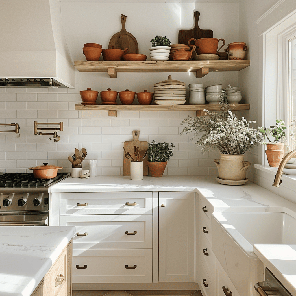
Kitchens offer wonderful opportunities for color, but permanence is a bigger consideration here given the investment involved in kitchen renovations. If you’re planning a larger update, consider Sage Revival for cabinetry – it’s trending strongly but has classic staying power that won’t date quickly.
For less permanent applications, Mediterranean Blue makes stunning backsplash tile, while Coral Blush can be surprisingly effective as a ceiling color, casting a flattering warm glow over the entire space.
One of my favorite kitchen updates this season was helping a client select new counter stools in a rich Sunset Terracotta leather, which transformed her neutral kitchen without requiring any construction or permanent changes.

Bedroom
Bedrooms generally benefit from colors that promote rest, but that doesn’t mean they need to be completely devoid of personality. This summer’s Sage Revival and Mediterranean Blue both offer enough color interest while still maintaining a restful quality.
I recently updated my own bedroom with Mediterranean Blue walls, which might sound bold, but the specific tone we’ve been seeing this season has enough gray undertone to feel surprisingly serene. I balanced this with plenty of white linens and natural wood elements to keep the space from feeling overwhelming.
For those who prefer neutral walls in the bedroom, any of our trending colors can be beautifully incorporated through bedding, artwork, or a statement piece of furniture like a bench or reading chair.
Home Office
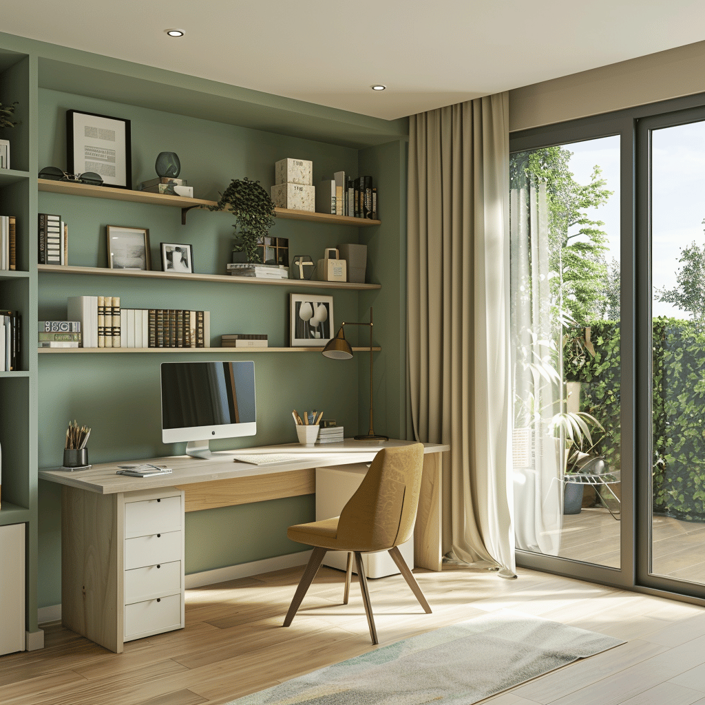
With remote work continuing to be prevalent, home offices deserve special color consideration. The psychological effects of color can impact productivity and creativity, making this an important space to get right.
Citron Yellow has been shown to promote creativity and optimism, making it excellent for home offices – though I recommend using it as an accent rather than a dominant color to prevent overstimulation.
Mediterranean Blue, meanwhile, can enhance focus and concentration, making it well-suited for office spaces where deep work is the priority. I’ve used this color effectively in home offices through feature walls behind computer screens or through substantial desk accessories.
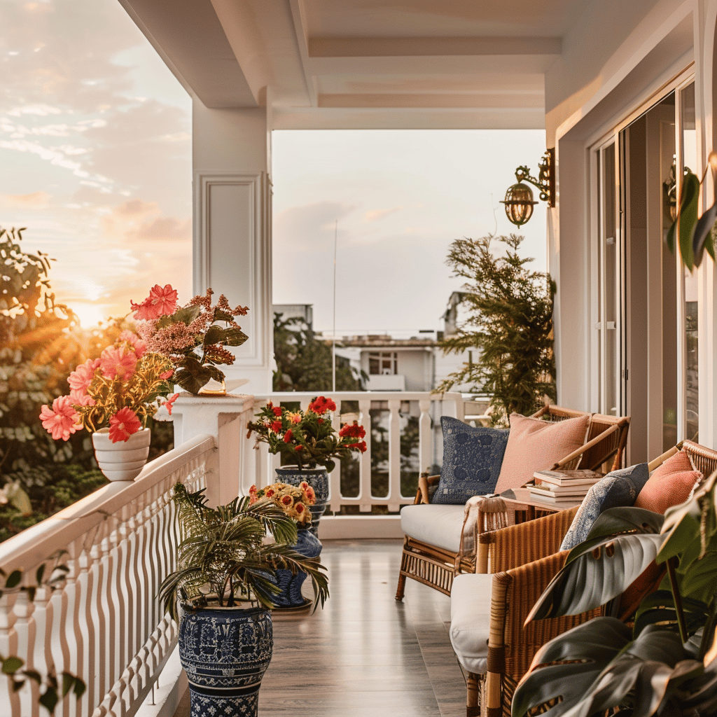
Seasonal Transitions and Longevity
While embracing seasonal trends can be fun, most of us don’t want to completely redecorate every few months. The good news is that this summer’s palette has been designed with longevity in mind.
Transitioning to Fall
As we eventually move toward autumn, this summer palette transitions remarkably well. The Sunset Terracotta and Sage Revival in particular will carry forward beautifully into fall, where they can be paired with deeper versions of themselves or complemented by richer jewel tones.
I recommend investing in larger pieces in colors with staying power (like Sage Revival or Mediterranean Blue) and using the more distinctly summery hues like Citron Yellow in easily changeable elements like cushions, throws, or artwork.
Investment Pieces vs. Seasonal Accents
When advising friends on color trends, I always suggest being strategic about where you introduce more trend-driven colors:
Consider for investment pieces:
- Sage Revival (for sofas, cabinetry, or quality rugs)
- Mediterranean Blue (for statement furniture or tiles)
- Sunset Terracotta (for leather goods or wood-frame furniture)
Better as seasonal accents:
- Citron Yellow (cushions, vases, artwork)
- Coral Blush (textiles, small furniture pieces, decorative objects)
By thinking about color application this way, you can build a home that feels current without becoming a slave to trends or creating unnecessary waste.
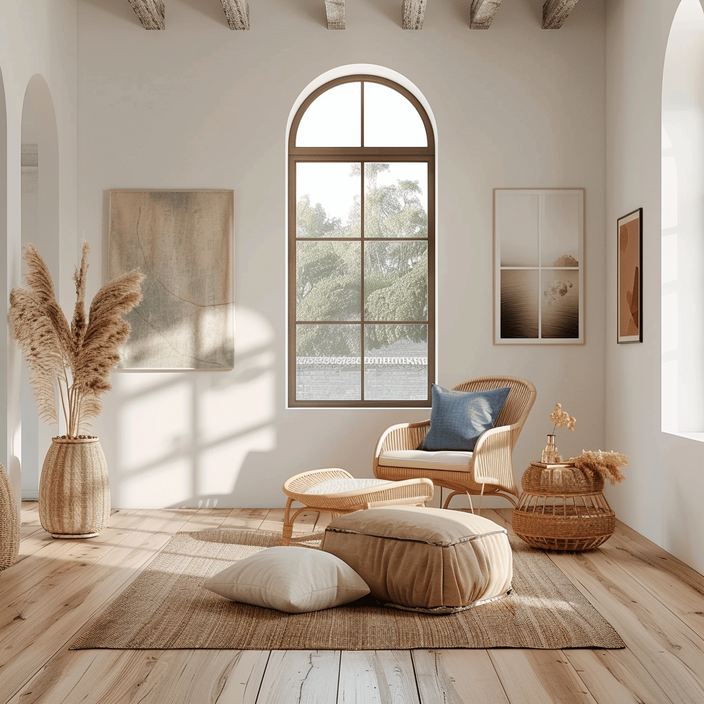
DIY Color Projects to Try
Not ready for major purchases but want to introduce this summer’s palette? Here are some approachable DIY projects I’ve tried myself or recommended to friends:
- Color-dipped ceramic planters: Take plain terracotta or white ceramic planters and paint the bottom third in Mediterranean Blue or Citron Yellow for an instant update to your houseplants.
- Ombré textile art: Create simple wall hangings using fabric in gradations of Coral Blush to Sunset Terracotta for an artistic statement that requires minimal craft skills.
- Painted furniture refresh: That old side table or wooden chair? Transform it with a coat of Sage Revival chalk paint for an on-trend update that costs very little.
- Color-blocked wall: If painting an entire room feels overwhelming, try painting just the lower or upper third of a wall in one of our trending colors, keeping the rest neutral.
I particularly love this last idea for rental properties, as it creates significant impact but is easily painted over when you move or want a change.
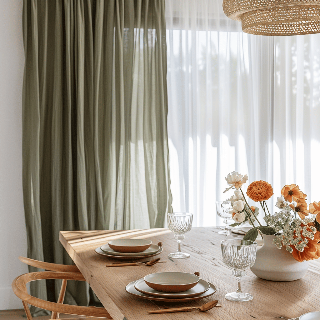
Final Thoughts: Color Confidence
As I’ve explored this summer’s color trends and incorporated them into my own home, the biggest lesson I’ve learned is about color confidence. There’s something uniquely personal about our color preferences, and while trends can guide us, the most successful spaces reflect the people who live in them.
Start small if you’re unsure – a few cushions or a painted tray in Citron Yellow might be enough to tell you whether you want more of that energy in your space. Or take the plunge with a Mediterranean Blue feature wall if you’re feeling bold. Either way, this summer’s palette offers wonderful opportunities to bring fresh energy into your home.
Remember that color should ultimately bring you joy. The trends I’ve outlined here provide a framework, but your own color story is what will make your home truly special. I hope this guide has inspired you to experiment with this season’s beautiful hues and find the perfect color combinations for your space.
What colors are you most drawn to this summer? I’d love to hear how you’re incorporating them into your home. Until next time, happy decorating!
If you love home decor and interior design as much as I do, check out these other articles I think you might like.
Breezy & Bright: Your Guide to Transitioning to Summer Décor
Below is a video that when played on your TV can turn your TV into a piece of art. There are hundreds of different videos to choose from.

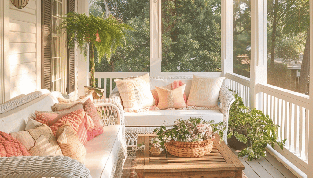
10 Ways to Create a Coastal Summer Retreat in Any Home
May 10, 2025 @ 1:49 pm
[…] Summer Color Palette: Using This Year’s Trending Hues […]
Styling with Rattan, Wicker, and Bamboo for Summer
May 11, 2025 @ 3:30 pm
[…] Summer Color Palette: Using This Year’s Trending Hues […]
Summer Tablescape : Ideas from Brunch to Dinner Parties
May 12, 2025 @ 12:55 pm
[…] Summer Color Palette: Using This Year’s Trending Hues […]
Indoor-Outdoor Living: Creating Seamless Summer Spaces
July 12, 2025 @ 6:00 pm
[…] If you love home decor and interior design as much as I do, check out these articles I think you might like. Summer Tablescape : Ideas from Brunch to Dinner Parties Styling with Rattan, Wicker, and Bamboo for Summer Summer Color Palette: Using This Year’s Trending Hues […]
Seasonal Art : How to Create Perfect Summer Gallery Walls
July 13, 2025 @ 11:02 pm
[…] Summer Color Palette: Using This Year’s Trending Hues […]
15 Best DIY Summer Decor Projects That Anyone Can Make
July 13, 2025 @ 11:18 pm
[…] Summer Color Palette: Using This Year’s Trending Hues […]
Best Ways to Style with Rattan, Wicker, and Bamboo for Summer
July 14, 2025 @ 12:28 am
[…] Summer Color Palette: Using This Year’s Trending Hues […]